In a mission to tell a unique story our journalism capstone enrolled in a massive open online course (MOOC) to expand our skills. The course was about data visualization. This page is a summation of the lessons we learned.
Module 1 – Finding and understanding data
In the first lesson we met our instructors – Alberto Cairo and Heather Krause. Cairo is a renowned expert in data visualization journalism. Krause is a primarily non-profit statistician who has freelanced in the field of data journalism, writing for outlets such as FiveThirtyEight. The first lesson in the course where to find data, how to understand it and what to do when we complete those tasks. These skills – finding, understanding and interpreting data – are the foundation for executing data journalism. When you don’t have a firm grasp of what your data means, you can wind up writing an analysis that completely misses the mark. Finding data has become much easier for non-experts because of the Internet. Searching for quality data can be as simple as a Google search. However, for topics where there isn’t a bevy of published research it can be far more difficult. Understanding data is one of the trickiest but most essential lessons we can learn. Dr. Krause teaches us how to create a “data biography” which is a great way to understand your data. Documenting the who, what, when, where and why of the data allows us to understand the data.
Module 2 – Character Development for your data story
In the second module of the course Heather focuses on tools for displaying data while Alberto reminds us how important it is to have good data. He warns that with the quality of the free tools at our disposal it can be easy to forget how important the data still is. Alberto also reminds us about how oversimplified data can be misleading.
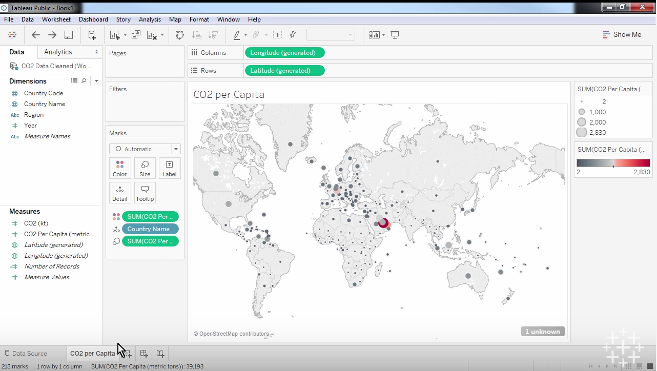
Heather teaches us about Tableau Public and Microsoft Excel as fine tools for cleaning and gathering data. She also offers Google Sheets as another alternative. One of the best perks about both Tableau and Excel is their ability to interact with live data on the web. This means we can download information from the Internet and import it directly into the tools we will use to clean it and begin our visualization.
Cleaning data is an essential step in the process of performing quality data journalism. Data cleaning can mean a few things. First, it could mean simply narrowing down your data to what you believe is essential to the story. It could also mean clarifying what the numbers you see quantify. In most cases data cleaning comes down to identifying what your data is, what it says, making sure the data matches (in terms of units of measurement or sample size or any variable really) and organizing the data in a way you and your team can understand.
Module 3 – basic plot elements of your story
In the third week of the course the scope of the lesson was narrowed a bit. Heather focused on how to take one variable and visualize it, a basic first step in visualizing our data.
During this module Alberto offered an important explanation for why we should visualize our data, “You should always visualize your data because it's very often the only way you will discover important features, important characteristics of those data.”
In order to isolate one variable to visualize our data must be cleaned and ready for use. Once that process is done we can visualize a variable. First we need to isolate the variable we want to visualize. Say for example we want to visualize the mean amount of points scored by Marquette men’s basketball. We could quickly calculate the number, then use a feature on Tableau to create a visualization of this data. Perhaps a histogram would be a good way to show this information. Then we can insert the rest of the relevant data, who they played in each game on the x axis which would be ordered chronologically, then how many points were scored on the y axis ordered from low at the bottom to high at the top.
Module 4 – Advancing the plot of your story
In our fourth week of the module we started to get into meatier information about data and statistical significance. After learning how to examine one variable in isolation last week, we learned how to tackle two variables at once this week. We also reviewed a few key concepts of the course in correlation versus causation and journalistic ethics when dealing with complex statistical analysis.
Building on last week’s lesson, we finally reached a point where a real story could be put together when Heather taught us about exploring the relationships between two variables. Essentially what you need to do is evaluate each variable the way we did last week, then you search for trends. In most of our cases we will likely have an idea of what the trends we expect to see are. When we lay out multiple variables and bring them together we can see if those trends exist. Whether they exist or not we move on and determine if they relationship we’ve discovered is statistically significant.
In order to determine if a statistically significant relationship exists between these two variables we need to have an idea of what the p-value is. P-value essentially represents the percent chance the correlation we’ve discovered is a statistically significant, meaning it’s a real connection. Heather explains the statistics community generally uses .05 or 5 percent as the threshold for what is or is not significant, but other researchers will narrow the threshold to .01 or 1 percent so they can be more rigid in their findings. My high school stats teacher used to say, “statistics means never having to say you’re certain.” What he meant is there is no such thing as certainty in the world of statistics. Rather, we use numbers like p-value and confidence intervals to say, “there’s a 95 percent chance this is true.” A 95 percent chance is obviously a great chance, but it’s not a definitive statement, it’s just stellar odds. If we find something has a p-value of .25, there’s a 25 percent chance the relationship we’re trying to evaluate is not statistically significant. Understanding the p-value can save us from plenty of bad reporting.
Module 5 – The plot thickens in your data story
As we near the end of the course we naturally focused on some of the finishing details about data visualization, namely the format in which to visualize our data. We learned about a great image to inform our decisions about the graphical format called ft.com/vocabulary. The site offers a large number of graphs and charts and explains the best time to use them. Alberto also directed us to two sites that will help with how exactly to execute this when we land on the format: datavizcatalogue.com and annkemery.com/essentials. He does warn though that certain graphical representations, such as the radial bar chart or the donut chart, can be ineffective, misleading or confusing.
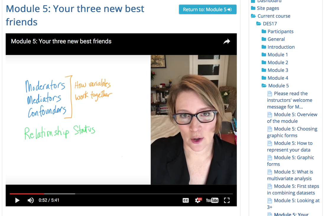
In this lesson we also learned about what Heather calls “our three new best friends.” She’s talking about moderators, mediators and confounders. Those three things describe how different variables interact with each other. Confounders are when an outside factor not considered in the study explains the statistical relationship between the two factors. Mediators are similar to confounders, but rather than being an outside factor, they are variables that lie within the original variable. In Heather’s example a mediator in the relationship between sunscreen and cancer is that there may be a harmful chemical in sunscreen that effects some users, which causes this link, not just sunscreen itself. Her example for a moderating variable goes along the same lines. The moderating factor is that sunscreen acts differently for different types of people. Perhaps people with different pigmentation see different results. Moderators, mediators and confounders are all relationship altering factors we must be aware of.
Module 6 – putting the data story together
In the final module we learn how to arrange out data most effectively and discuss the importance of our copy. Without good writing that explains our data, what it says and why it matters, our data would be mostly useless. Heather explains how important transparency is. She says if we make our process and our results transparent we can be “bulletproof” in our data analysis. Then she goes on to say there’s no such thing is bulletproof. She quotes an important historic statistician who said, “All models are wrong, but some are useful.” What she means is there is no exact right way to do any of this. However, if we’re transparent the inherent flaws of whatever method we use will be clear and our audience will know we are not misleading them or hiding anything.
In this lesson we also revisited a topic we discussed earlier in the course, but from a different angle. Earlier we talked about p-value’s and confidence intervals, but here we talk about how to deal with uncertainty. Essentially what we must do is evaluate how certain and confident we are in our data (which is a mathematical process) and communicate that clearly.
There are a number of lessons learned throughout the course I haven’t laid out here and there is a lengthy list of valuable links and outside resources we discussed that I haven’t linked here as well. But this is a rough outline of many of the most important lessons I learned from this course about data visualization and data journalism. I’ve taken two statistics courses in my life and as a sports fan and analytics supporter I’ve always been solid when it comes to understanding data. However, this course showed me how much about data journalism and visualization I knew nothing about. This course provided me with requisite information to complete the project our capstone project our team set out to create, but also tools to better involve data and data visualizations in my sports writing.
Discussion Section
In each lesson we had to participate in a discussion centered around one of three questions. Here are the questions and threads I responded to:
Module 1
Question: What is your opinion of how the journalists at FiveThirtyEight handled the analysis of the Nigerian Kidnappings? (https://source.opennews.org/en-US/articles/gdelt-decontextualized-data/)
Thread post: The issue with the FiveThirtyEight corelation intent is not context related but it is a missunderstading. In the case of Chalabi’s analysis, she missed a couple of W's: What, the dataset's content; Why, the dataset's purpose. By answering W questions, by building the Data Biography, she might have aquired a full understansing of the data used to make her analysis. Eventhough, she had not understood the dataset there is some data that raises a flag. "2,285 kidnappings in Nigeria in the first four months of 2014" or the peak in the time series, should be taken as an outlier, an indicator that information must be re-read and re-checked. I believe that crosschecking the article content before it is published could be helpful.My response: The point about the missing Ws is a good one. There was a clear disconnect between her breakdown of the information and what the information represented. This isn't the kind of mistake I would expect 538 to make. It's truly surprising this made it through an editor without anyone questioning the outlier you pointed out.
Module 2
Question: You’re doing a story on school performance. The data shows that one of the schools has standardized scores that have increased much faster than all other schools in that state. How do you proceed?
Thread post: In Brazil, school performance is monitored by the Ideb (Basic education development index). Basically, it's a formula used by the Ministry of Education to check if the education institutions are performing well: a lot of variables are taken into account and merged into a compound measure. Alberto Cairo talked about in the 6th chapter of "The Truthful Art", if you want to know a bit more.
This school in my city, Colégio Medalha Milagrosa, was by far the best among the local public institutions. While most of the schools were struggling to reach the goal score set by the federal government, Medalha Milgarosa was well above it.
It's results were not really skyrocketing, but were growing in a steady pace, while most of the other schools registered plenty of ups and downs in recent years.
Before hitting the streets and talking to students, families and teachers, I searched for more numbers to crunch.
The brazilian educational census revealed that Medalha Milagrosa's students family income was well above the municipal median and average. A quick check in Excel showed me that, yes, there was a strong correlation between this statistic and the Ideb score.
Bingo!
Now I had a few more questions to ask people when reporting in the ground, and also a specific subject to approach when talking to an specialist in education.
Looking for more related data, comparing it and checking for possible statistical correlation between variables allowed me to dive deeper into the subject, even before putting my shoes and hat on -- something I definitely did after finishing all the homework.
My response: This is a great anecdote for the topic. What direction did you take the story? I can see a few different topics coming out of that. Why was this school the choice for the wealthy? Had the area around the school improved in any measurable ways durig the time the scores improved? Were other schools nearby struggling consistently as Medalha Milagrosa's scores went up consistently? Was this a trend throughout the country? Did other schools scores correlate directly with the incomes of the students' families?
Module 3
Question: As a data storyteller, is it your job to use the data in a way that will be understood by the average audience? Or is it your job to use the data in a way that is technically correct? How do you balance these two?
Thread post: I think the type of story and the audience need to be taken into account. If the audience happens to be wide containing people who are not so keen on details and those who are, then I'd probably try to make the design of the story such that it has both sides. First a lighter story telling the story without too many details. Then, a more technical story drilling down on details. This way, the reader could stop reading after the first part.
Another response: I disagree with you dear Hanna as majorly the data journalist should be accurate & present his/her own story applying the 'clarification over simplification" rule of guidelines where the journalist is the one who will provide the information to the audience; their level of understanding shroud be taken into account but not to that extent where to ruin the credibility of the data.
Original poster's response: I think I wasn't very clear with my explanation. I don't favour simplification and would never ruin the credibility of the data. First of all, I was only referring to a case where the audience is very broad. Secondly, this kind of structure is where the story is divided into two parts is possible. Scientific writing could be seen as one example. Also, some information designers have used this technique in brochures. I do not claim that this would work in every case. I simply tried to bring something new to the table.
My response: I agree with you, Hannah. Knowing your audience is a key to any kind of writing, data journalism is no exception. If you know your audience is primarily data junkies, then no need to spend much time dumbing everything down, just give the facts and tell the story. However, when you write for a broader audience the numbers mean nothing if they cannot be understood. Certainly the credibility of the data must be maintained, but adding an asterisk or an appendix in order to clarify what the finer details are telling the audience doesn't compromise any credibility, rather it broadens the audience who can consume the content.
Module 4
Question: Data visualization is a very powerful tool. How important is it that any data visualization that is made public through social media be statistically accurate? How will you respond when you see analysis being published on social media that you believe is incorrect? Does your response vary based on whether you think the data is intentionally or accidentally being misused?
Thread post: I find it hard to walk away from bad data stories on social media. Recently I saw how someone was using just a 2D image to justify I the scale of Donald Trump's victory in the 2016 US Presidential Election. The map used showed the number of counties in the US Trump won in red compared to the number won by rival by Hilary Clinton in blue. From its appearance, it looked like Trump trounced Clinton as the country was awash in red, with blue limited to a places on both coasts. To counter this argument I posted a 3D map that took into account population density and degree of victory per county. The difference was marked. Instead of showing a rampant Trump victory, it showed that Clinton was way more competitive.
My response: Great example - specifically about the dangers of bad visualization. These types of images are often used in pro-electoral college arguments. Not to get bogged down in that discussion, but no matter the side you take up in the electoral college conversation, 2D maps of counties nationally are rather useless. When these types of things are shared in any real quantity on social media I have a hard time stopping myself from inserting myself into the conversation.
Module 5
Question: Many times you cannot tell from looking at the data which variables are moderators, mediators or mediators. What practical steps can you take to help figure this out? When does a relationship between two variables indicate that one causes the other?
Thread post: As we know, correlation between variables does not mean causation. Correlation, however, can be a clue that there is something going on that deserves further research. The best way to learn whether or not such a relationship between variables indicates that one causes another would be to do a scientific study with a control variable. This is often not possible, so the next best thing is to observe data over long periods of time. Understanding what mediators, moderators and confounders could be involved may require expert opinions, so the journalist or investigator must seek advice, preferably from researchers and specialists in the field. Causation can be difficult to establish, so it is good to state in your story the limitations of the data, the questions that are raised and what may be examined in future studies.
My response: If one is considering writing a story about a topic like this and they were unable to conduct a study of any kind or get real tangible data from researchers, there's really only one kind of story that could ethically be told. Essentially, there's a relationship between A and B. We know this to be true. What we don't know is why. Here are reasons there could be for this relationship (list moderating, mediating and confounding factors). Quotes from experts in the field of study about the potential hypotheses would be important. Of course, when venturing into a story like this where the data is thin, a journalist needs to be extremely cautious and warn their audience the story has no answer, rather a simple fact about a statistical relationship we need to investigate further.
Module 6
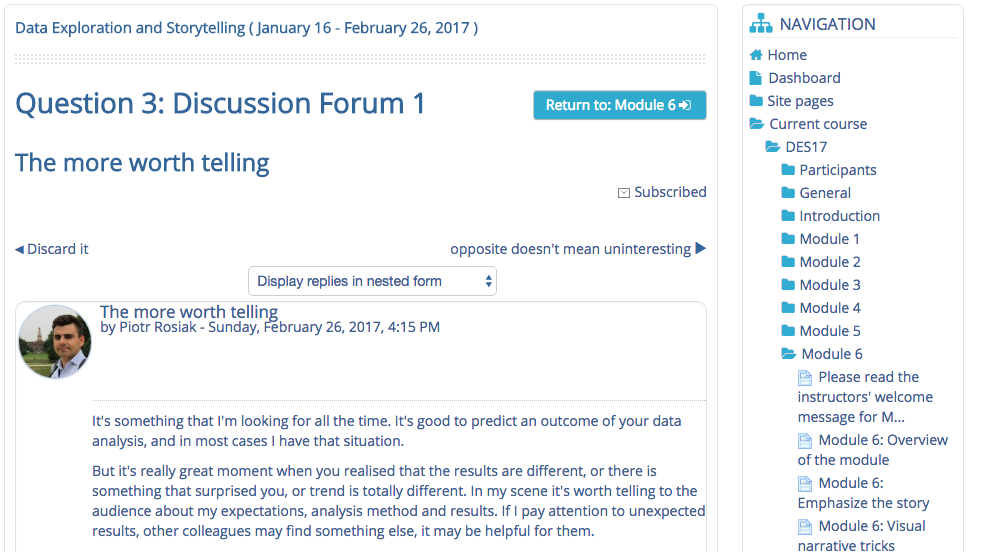
Question: What are you going to do if you work on a story for a long time and the data results turn out to be either the opposite of what you thought or show no real trends at all?
Thread post: It's something that I'm looking for all the time. It's good to predict an outcome of your data analysis, and in most cases I have that situation. But it's really great moment when you realised that the results are different, or there is something that surprised you, or trend is totally different. In my scene it's worth telling to the audience about my expectations, analysis method and results. If I pay attention to unexpected results, other colleagues may find something else, it may be helpful for them. My response: Exactly! When the results don't meet your hypothesis, the story can often be more interesting. My area of interest is sports. On a number of occasions I've written a lede for a column before digging into the numbers I knew were necessary to support my thesis, only to find my thesis was incorrect. Then the story becomes, perhaps you were like me and though XYZ, I'm here to tell you, the numbers say otherwise. In situations where you've done a great deal of research it's still important to publish because others may have the same question or find something in you data you may have overlooked. No need to hide work well done.
